As I watched a segment of MSNBC’s Now w/ ALEX WAGNER hosted by fill-in Luke Russert I saw and heard a horrific piece of data embed in a great report about the ACA.
While I posted the 6:27 minute segment below, allow me to post three screen shots that specifically drew my attention and an associated flash of scorn. The last screenshot was a “show-stopper” because it appeared to line-up the opposite of current reports about support for the ACA.

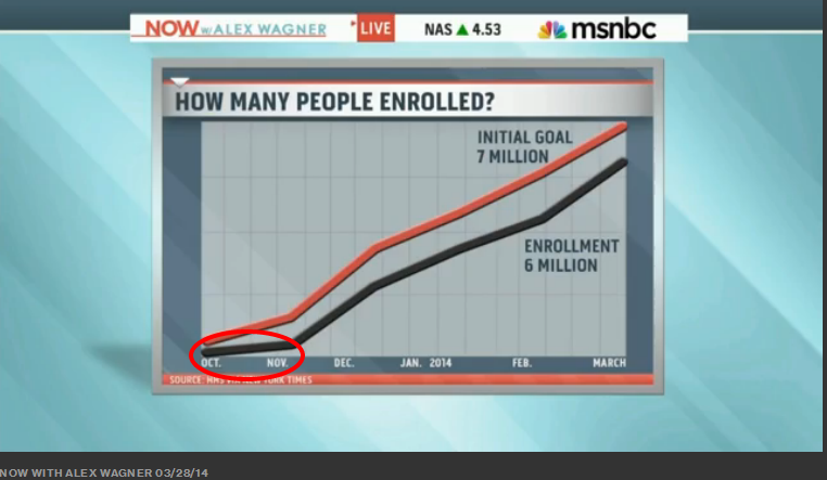
We see the existential, the obvious and expected lag for the failed initial website roll out. After that we see significant enrollment trend lining right along with CBO projections. Also clearly illustrated is the “human spike” everyone expected as the enrollment deadline drew (or draws near).

Quick look at enrollment for January policy coverage and the imminent March, 31st deadline for April 1, 2014 coverage. No surprise there!

And, there-in lies my problem! AP/GfK via an online survey of just over 1,012 adults, reports only 26% of respondents “support” The ACA (AKA ObamaCare). Not only are the AP/GfK findings out whack with other surveys, GfK has questionable survey practices. I will explore my point in a bit and just before the embedded of Luke Russert’s segment based on the AP/GfK findings. Let me remind the embed segment has a far greater and productive message as it is titled “data that matters.” Yet, I seriously question use of the AP/GfK data to develop the segment, despite the report’s recent release.
Yesterday, AP/GfK ran a lead story that included the following excerpt. Bold font highlighted by The Pardu.
We see the existential, the obvious and expected lag for the failed initial website roll out. After that we see significant enrollment trend lining right along with CBO projections. Also clearly illustrated is the “human spike” everyone expected as the enrollment deadline drew (or draws near).
|
|||
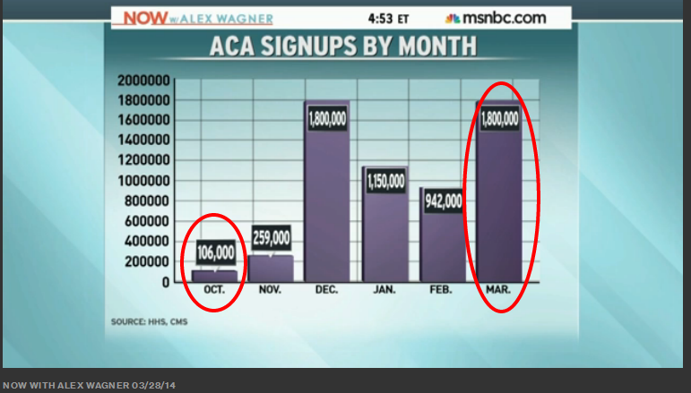
Quick look at enrollment for January policy coverage and the imminent March, 31st deadline for April 1, 2014 coverage. No surprise there!
|
|||
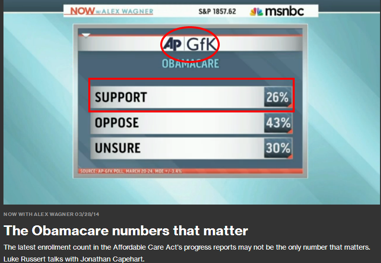 |
 WASHINGTON (AP) — Public support for President Barack Obama’s health care law is languishing at its lowest level since passage of the landmark legislation four years ago, according to a new poll.
The Associated Press-GfK survey finds that 26 percent of Americans support the Affordable Care Act.
Read more linked via title
AP/GfK
MAR 28
Excerpt
The poll found that much of the slippage for the health care law over the last four years has come from a drop in support, not an increase in opposition.
In April of 2010, soon after the law passed, 50 percent of Americans said they were opposed to it, while 39 percent were in favor. Ten percent were on the fence.
Now, just 26 percent say they are in favor, a drop of 13 percentage points. Forty-three percent say they are opposed, a drop of 7 percentage points since that poll four years ago. But the number who neither support nor oppose the law has tripled, to 30 percent.
The 26 percent in favor in the AP-GfK poll is not significantly different from the 27 percent registered in January and December.
The AP-GfK Poll was conducted March 20-24 using KnowledgePanel, GfK’s probability-based online panel designed to be representative of the U.S. population. It involved online interviews with 1,012 adults and has a margin of sampling error of plus or minus 3.4 percentage points for all respondents.
Respondents were first selected randomly using phone or mail survey methods and were later interviewed online. People selected for KnowledgePanel who didn’t otherwise have access to the Internet were provided with the ability to access the Internet at no cost to them.

WASHINGTON (AP) — Public support for President Barack Obama’s health care law is languishing at its lowest level since passage of the landmark legislation four years ago, according to a new poll.
The Associated Press-GfK survey finds that 26 percent of Americans support the Affordable Care Act.
Read more linked via title
AP/GfK
MAR 28
Excerpt
|
__________________________________________________________________________
Let’s take a look at AP/GfK to provide perspective on the 26% who “support” the ACA. My past experience with AP/GfK was along this line. As we approached the 2012 General Election, I ran across this headline:
“Majority Harbor Prejudice towards blacks.”
“Majority Harbor Prejudice towards blacks.”
|
TPI (October 2012)
If you never ever review poll data, you have to give a look at the AP/GfK Poll data released just a few days before the November 6th Elections. The poll’s major tickler was, a “Majority harbor prejudice towards blacks”. [See Link above]
|
The TPI Link provided in the table will take you to even more startling and ridiculous survey findings related to perceptions of candidate religion. The 1,071 survey respondents (predominately white and from the South) seem to have been comprised of a potential respondent pool stacked for achievement of desired results. The headline: “Majority harbor prejudice towards blacks,” was both indicative of what many should consider flawed survey administration via GfK, and indicative of the dangers of subsequent headlining via media or political operatives.
Now for the Russert, NOW W/Alex Wagner, segment. It is a good story, once you pass through the first 1:50 seconds which include suspect survey findings from the very “suspect” Growth for Knowledge (GfK).
Excerpt
But more than two-thirds distrust polls conducted by political parties or candidates and automated telephone surveys. Media polls fall in the middle, with somewhat more distrusting than trusting. Note: the “News media” category below.

“Which Polls Fared Best (and Worst) in the 2012 Presidential Race”Excerpt
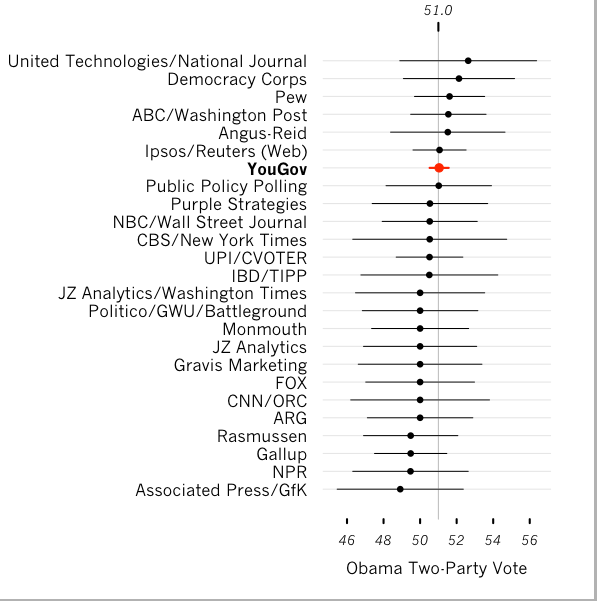
We can also extend the analysis to consider the 90 polling firms that conducted at least one likely voter poll in the final three weeks of the campaign. One should probably not read too much into the results for the individual firms that issued just one or two polls, which is not a sufficient sample size to measure reliability. However, a look at this broader collective group of pollsters, and the techniques they use, may tell us something about which methods are most effective.

Figure 1 below shows the point estimates (and reported margins of error) for final national polls from different polling organizations for the Obama share of the national major party vote. The final YouGov poll, released on Sunday November 4, based on 36,472 interviews of likely voters between October 31 and November 3, had Obama at 48.5 percent, Romney at 46.5 percent, other candidates at 2.3 percent, and the remaining 2.7 percent of voters undecided. This translates into a 51.1 percent share of the national major party vote for Obama. As of this writing, the Associated Press reports that the Obama share of the national two party vote was 51.0 percent, so the YouGov estimate had an error of less than 0.1 percent. Two other polling organizations also pegged the Obama lead at two percent.


I should out of fairness state, ” I have never heard any host on CNN refer to Rasmussen” as “leaning Right.”
